

Impactful.
Creating story-driven, highly visual experience that educates, inspires action, and makes every visitor feel part of a national campaign.
Visit the website at echoaus.org.au
Echo is an Australian nonprofit transforming how young Australians engage with economics, whilst advocating for the accessibility and engagement of economic literacy. With guest speakers including former prime ministers, Reserve Bank leaders and top economists, Echo has built a national platform that connects students directly with the forces shaping their future through three ways:
Conferences
Campaign
Content
The new website had to serve their changing scale, story and audience, that can tell their story with clarity and conviction, spotlighting their national impact, whilst presenting information on their conferences, and providing content and resources to promote their cause of democratising economic literacy.
Visit Live Website
Visit the website at echoaus.org.au
Design Discussion
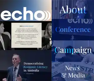
Landing page
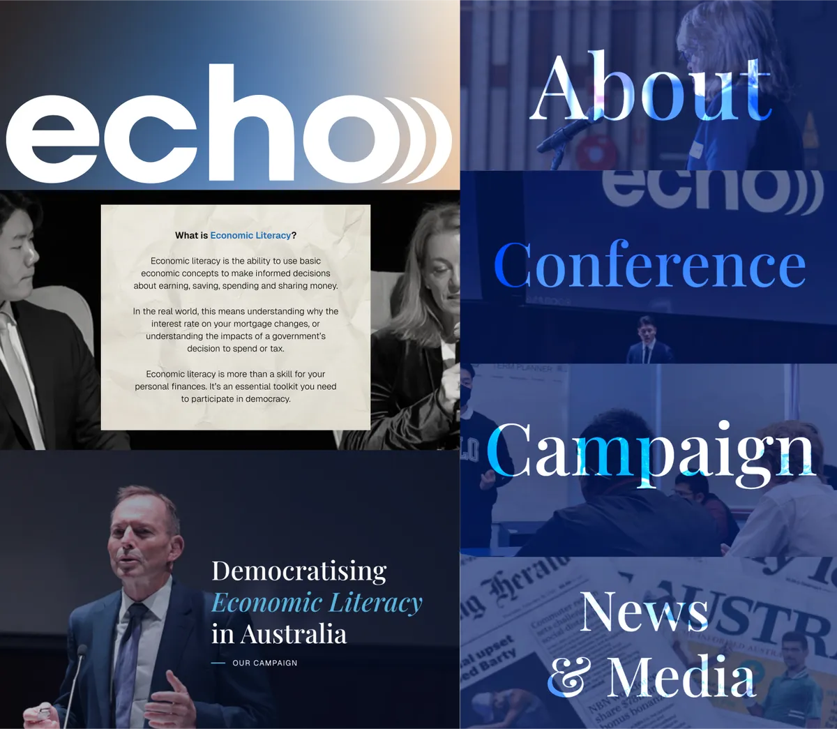
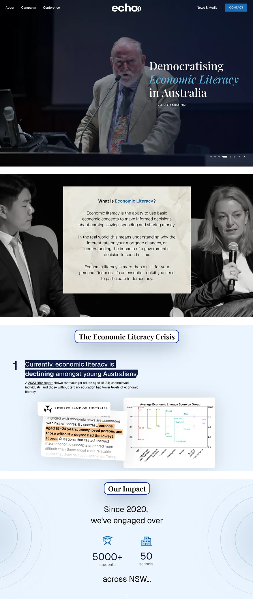
The homepage opens with an animated headline — “Democratising Economic Literacy in Australia” — fading in word-by-word to emphasise the urgency and clarity of the cause, with past high-profile guest speakers in the background. A scroll-triggered sequence guides users through Echo’s mission, campaign pillars, and impact with animated number counters and sticky section transitions.
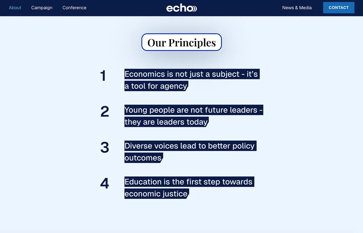
About Page
The About page pairs information about Echo, their core principles, and their team, with profile cards that animate in on scroll. Here, motion is used subtly — fading in values and team photos to create an approachable yet mission-driven tone.
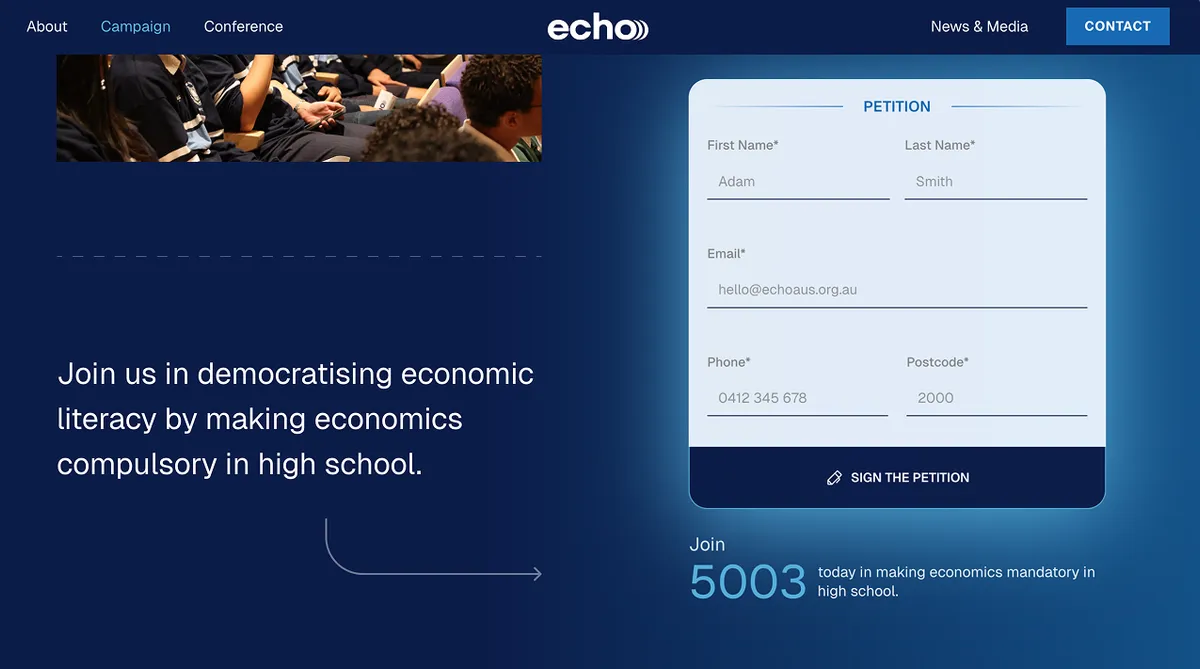
Campaign Page
The Campaign page functions like a call to action. We use pinned scrolling and background fades to guide readers through the problem (economic illiteracy), Echo’s response, and their national petition. Typography grows bolder and more urgent as the narrative intensifies, concluding with an embedded petition form and call to sign.
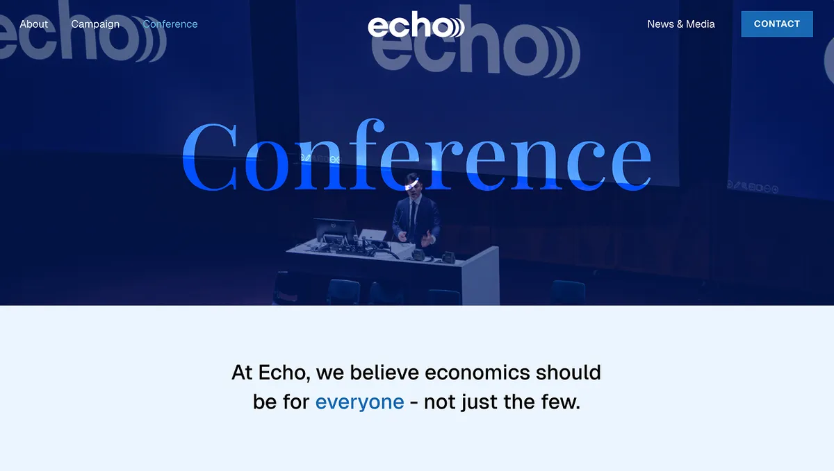
Conference Page
The Conference Page is where Echo’s credibility shines. The new website presents the purpose of the Echo Conference and its significance. Each past conference is designed as a content block with hover animations that preview key info (speakers, venue, attendance). Each speaker has a short biography attached that users can expand, alongside a gallery of images from past conferences and information for future conferences.
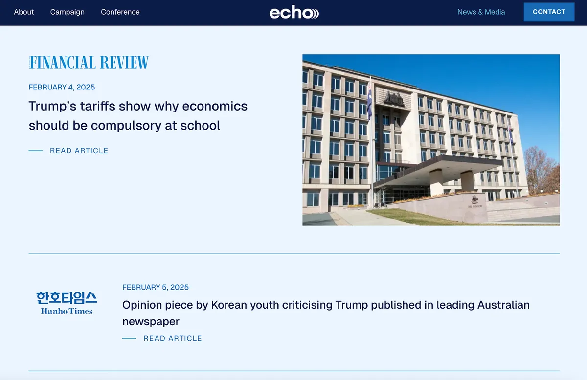
News & Media Page
The News & Media page features a clean masonry-style layout for news articles and press, with a smooth fade-in on load. Designed to feel like a live feed of credibility — showing Echo’s presence in major publications like the AFR and ABC (with a live audio interview embedded on the website).
...
Designing Echo’s new website taught me the power of story-first design: how clarity, structure, and animation can guide users through complex information without overwhelming them.
Through this project, I gained experience working with a real-world team, supporting a national campaign that featured guest speakers, connected with students across NSW and beyond, and helped amplify youth voices through a petition-driven movement for economic education reform.
Return to all my projects