Utility.
Integrating an appealing and playful design with functional elements and advanced, feature-rich capabilities to craft a comprehensive, yet enjoyable and immersive user experience
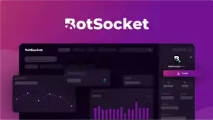
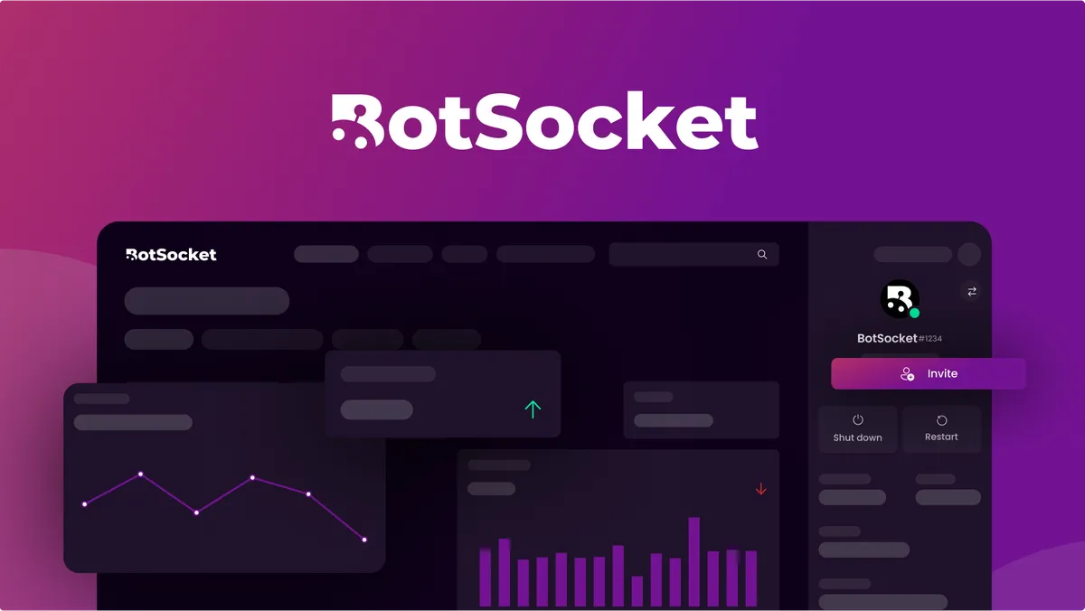
BotSocket was a Discord-based project that allowed users to create customised Discord bots without code that could be tailored their Discord servers.
I worked with the team to create the branding guidelines, colours, website design, marketing ideas, and the user interface and experience of the dashboard. In such an application, the target audience is regular community owners who want a quick and simple professional solution for automated features in a Discord server, without needing to deal with the complexities of making a Discord bot that might require comprehensive knowledge in code or the technical aspects of Discord.
The design was optimised to be user-friendly, intuitive, and visually aesthetic to appeal to this audience - to pack in a range of utilities without overloading the user. Similarly, the brand identity and marketing reflected these ideals, being simple, playful and engaging yet encompassing of a range of features to attract users seeking a streamlined and enjoyable experience in managing Discord servers.
Altogether, I am very proud of the result of the project and believe that it elicits each of the goals and ideals mentioned to a high standard.
Brand Identity & Colours
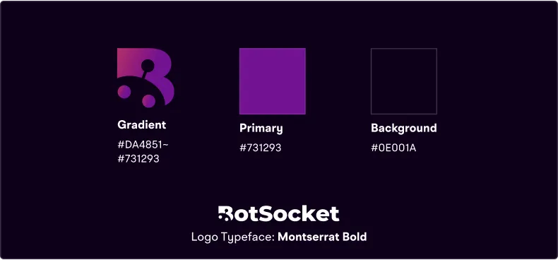
Purple was decided as a primary colour, implying a connotation of innovation while appearing friendly and playful. The main aspects of the brand identity; colour palette, typeface and logo is shown here:
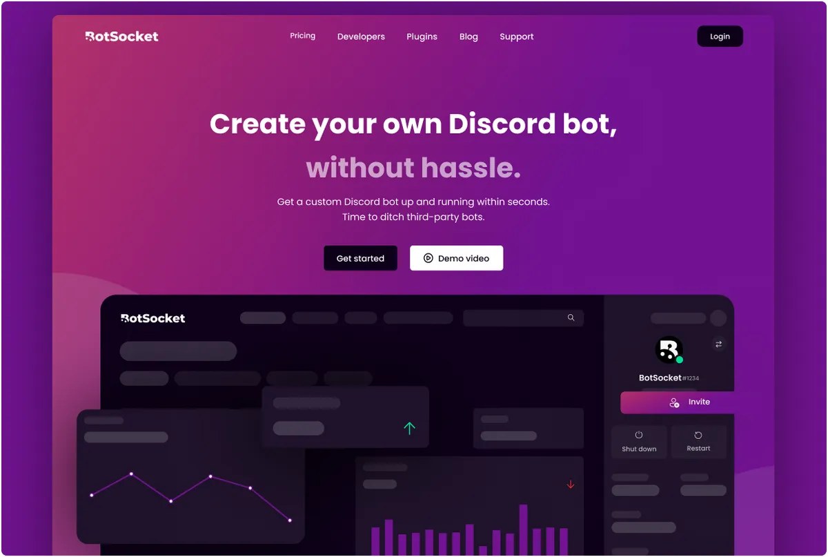
These were used throughout the promotional material, including the landing page:
User Interface Assets
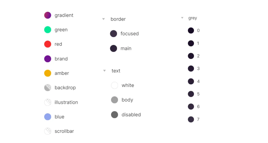
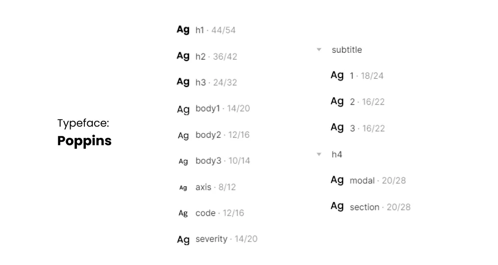
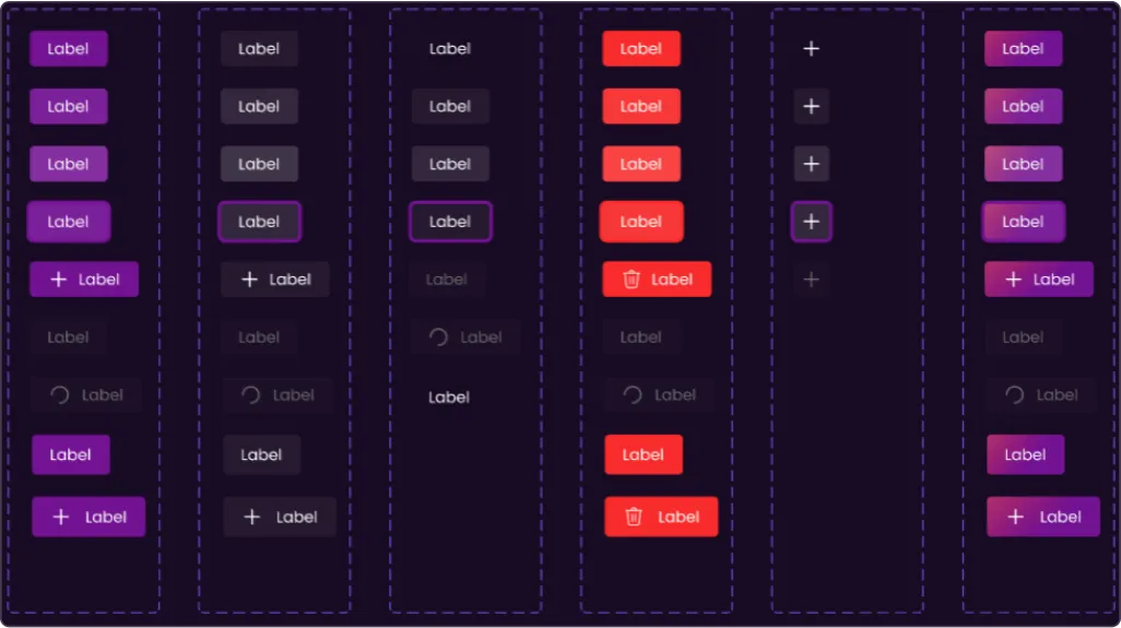
A set of style assets including colours and fonts were developed to ensure a consistent design of the user interface.
Colour Styles
Text Styles
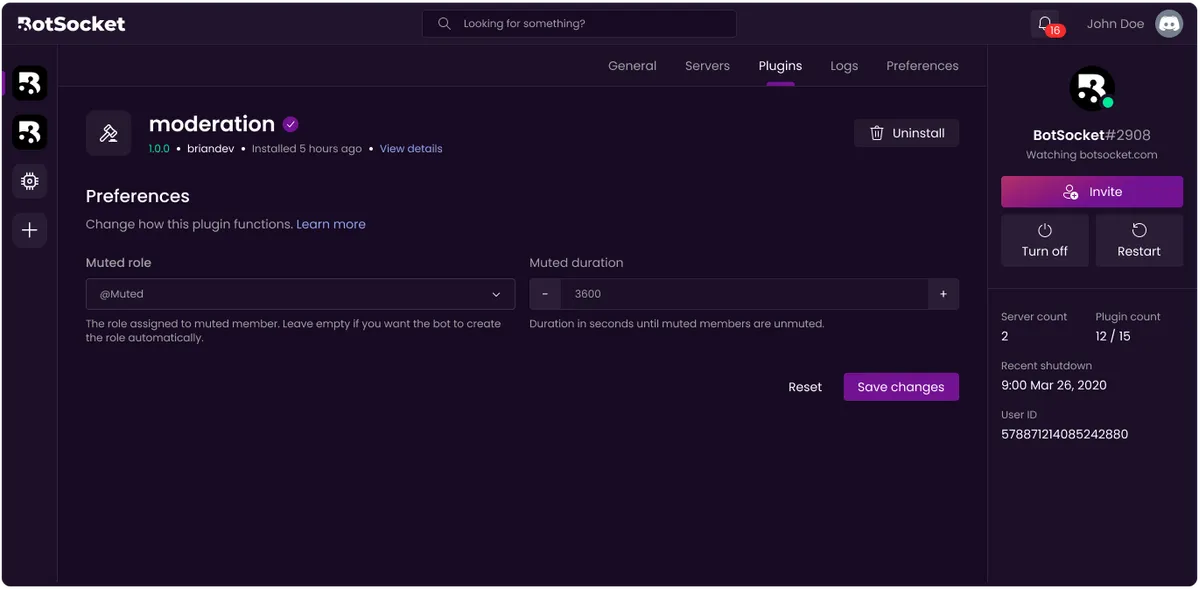
Interactive Components
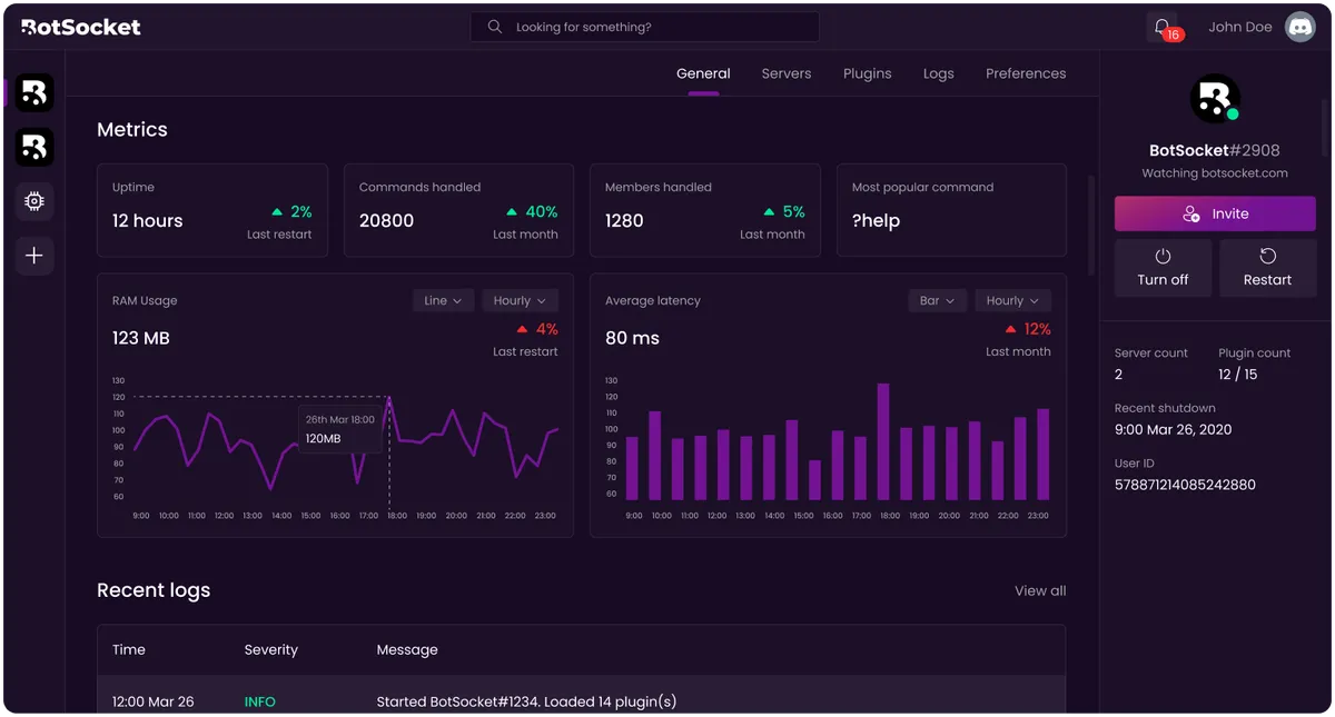
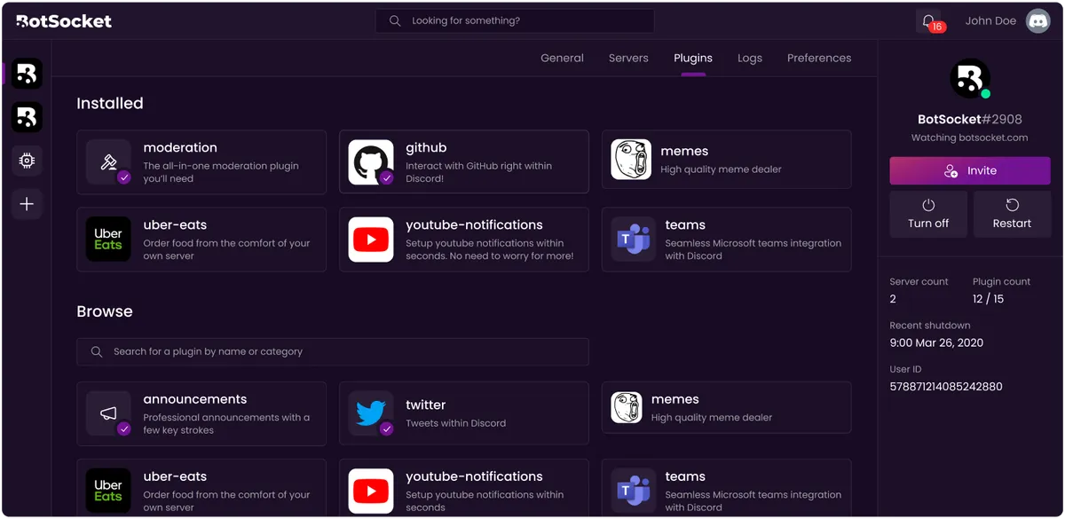
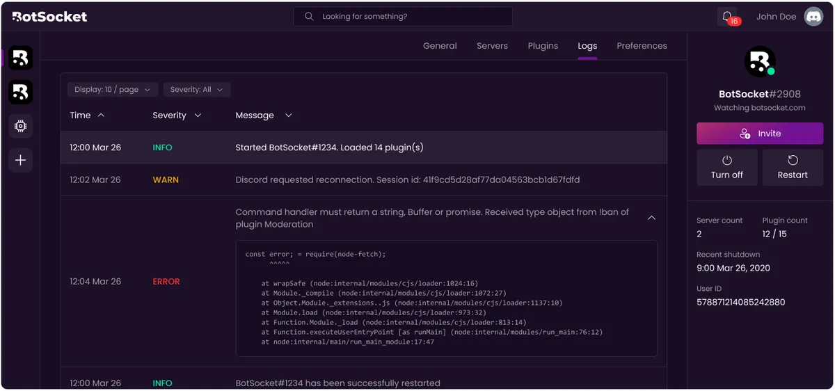
Dashboard
Main App
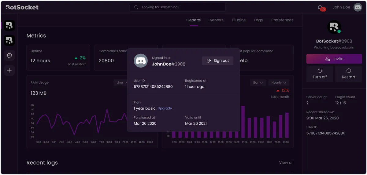
Other Screens
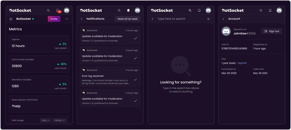
Mobile Variants
Onboarding
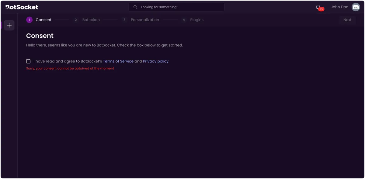
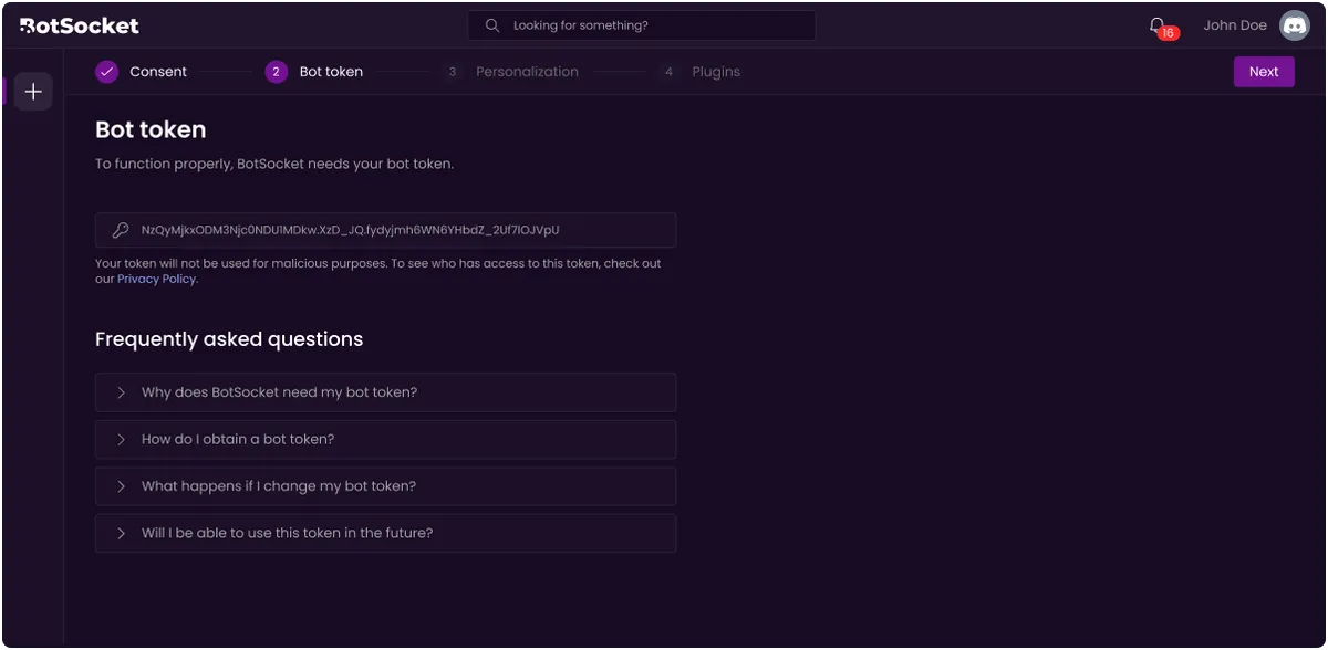
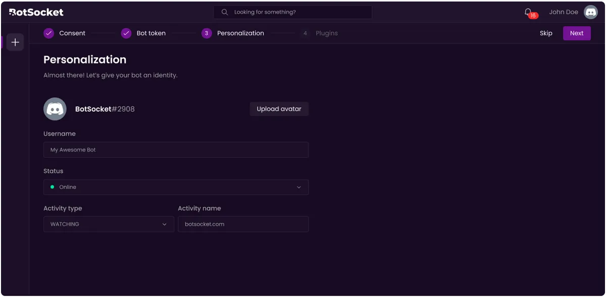
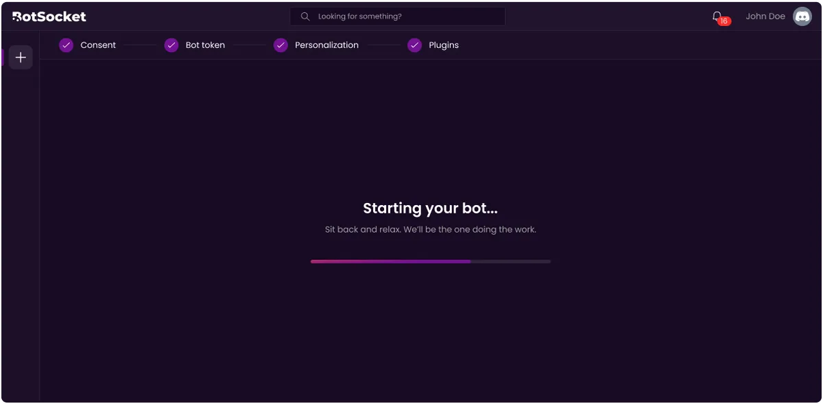
For BotSocket to work, users had to manually create a Discord Application and provide BotSocket with details like the token. Then, all properties and functionalities of the application could be controlled and modified by BotSocket to create the user experience, allowing all interactions from the user to be done within an easy-to-follow user interface.
Here are snapshots from the onboarding process:
Design Process - Dashboard
The design underwent several phases before reaching the final design.
Iteration #1
This was the initial rough wireframe of the dashboard:
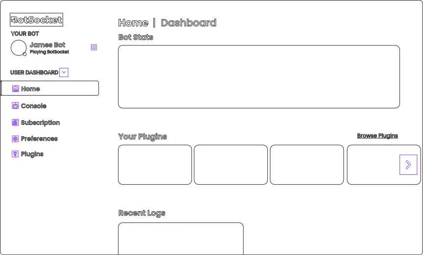
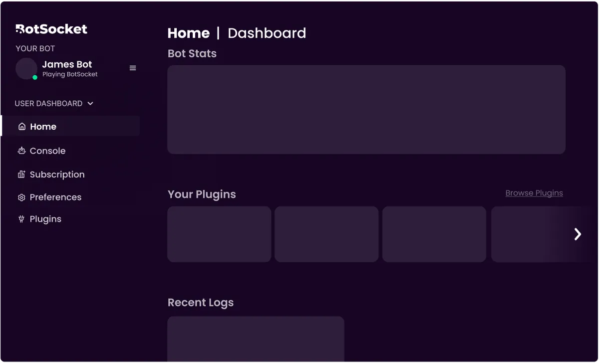
We liked how the purple colour went well, and the general clarity of the design and ease of navigation since it wasn’t visually overwhelming.
However, several issues were immediately identified.
Hierarchy could be improved as all elements seem to be sitting above the same purple background.
There is no clear space to add essential controls like “Invite”, “Shut down” and “Restart”.
There is no clear space to add other important features like notifications, or a search bar.
“Your Plugins” have a fixed set of items that aren’t supposed to be browsed. The carousel design is inappropriate, and it unintentionally gives some plugins more emphasis than others.
The sidebar only includes 5 items and the bot itself. This means the bottom part has a lot of wasted space, and a horizontal design might be more suitable.
The dropdown for “User Dashboard” has an unclear purpose. It was intended to allow you to switch between a User and Developer Dashboard, however the Developer Dashboard does not need to be visible for most users and would be better suited as a separate page altogether.
Iteration #2
Consequently, here was one of the next iterations of the dashboard:
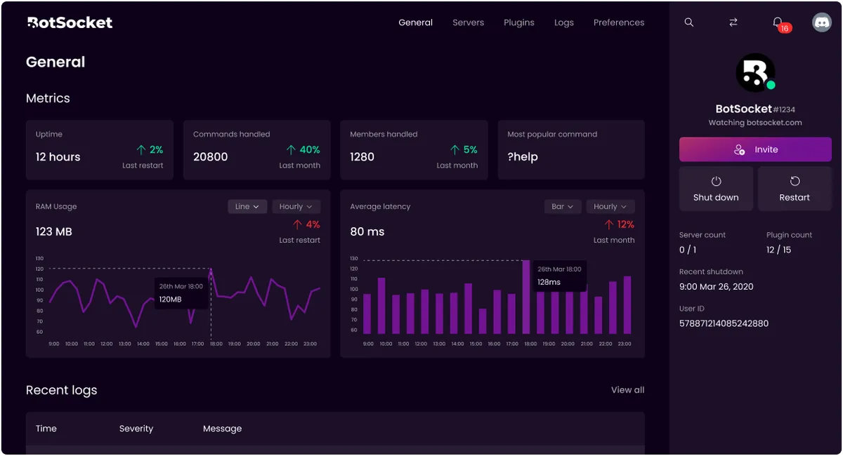
This design is significantly more reminiscent of the final design, however, we still found some navigational issues with it, particularly with the buttons in the top right corner.
In the top right corner, the buttons to search, switch bots and the notifications are unclear and hard to find.
The buttons are also not very descriptive, and some people may struggle to recognise buttons like the button for switching bots immediately.
These buttons are also positioned in the same place of the same hierarchy, but they were not related to each other.
They were also somewhat hidden also didn’t look very clickable.
It was also intended that clicking on of some of these items would transform the sidebar into the function of the button, as shown:
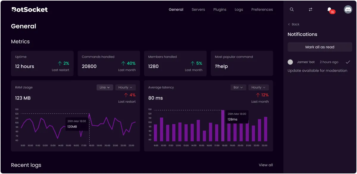
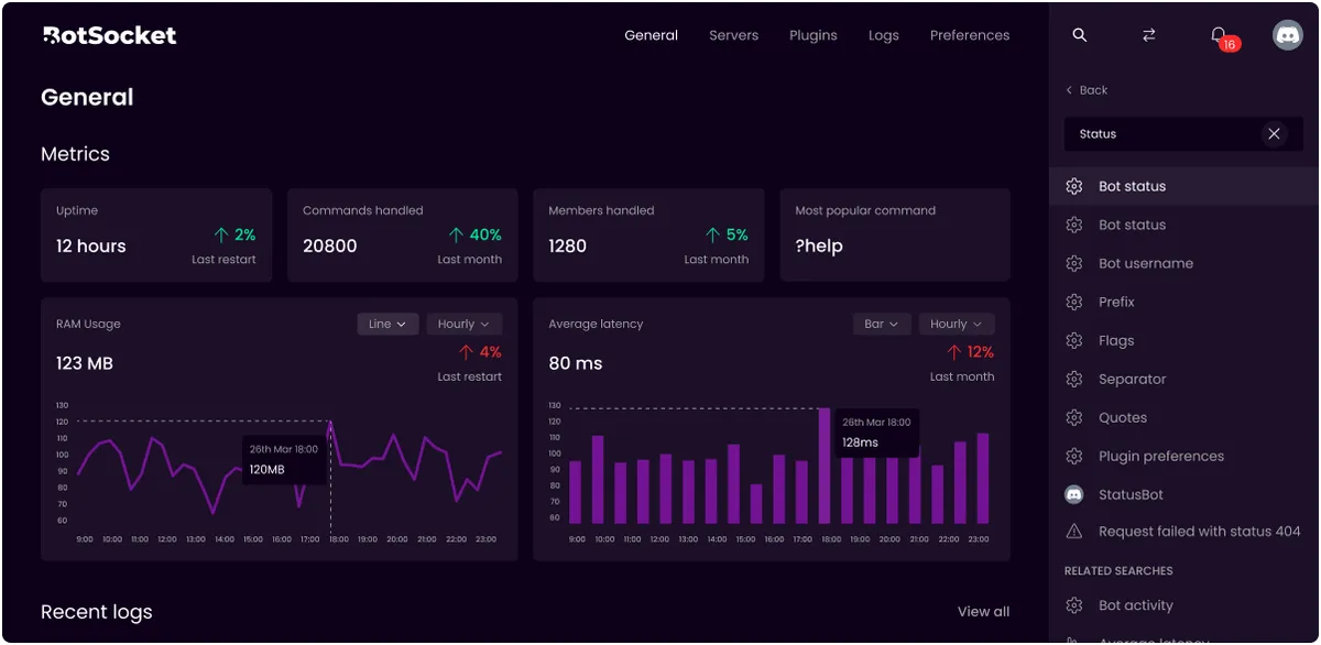
Although visually coherent, there was another functional issue with the design. It wasn’t clear how to exit out of these menus. There was the back button or clicking the icon again, but for tools that are likely to be regularly used, it should be easier.
Final Iteration
With this in mind, we reached the final design:

We separated each of the menu items in the top right corner throughout the interface.
Switching between bots can be easily done on the left sidebar.
Searching is available through the middle search bar at the top.
Notifications remained in the top right corner next to account.
This separated the four unrelated items and gave the interface more clarity.
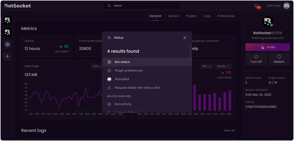
Instead of transforming the right sidebar, an essential space, we relied on popups for each of these:
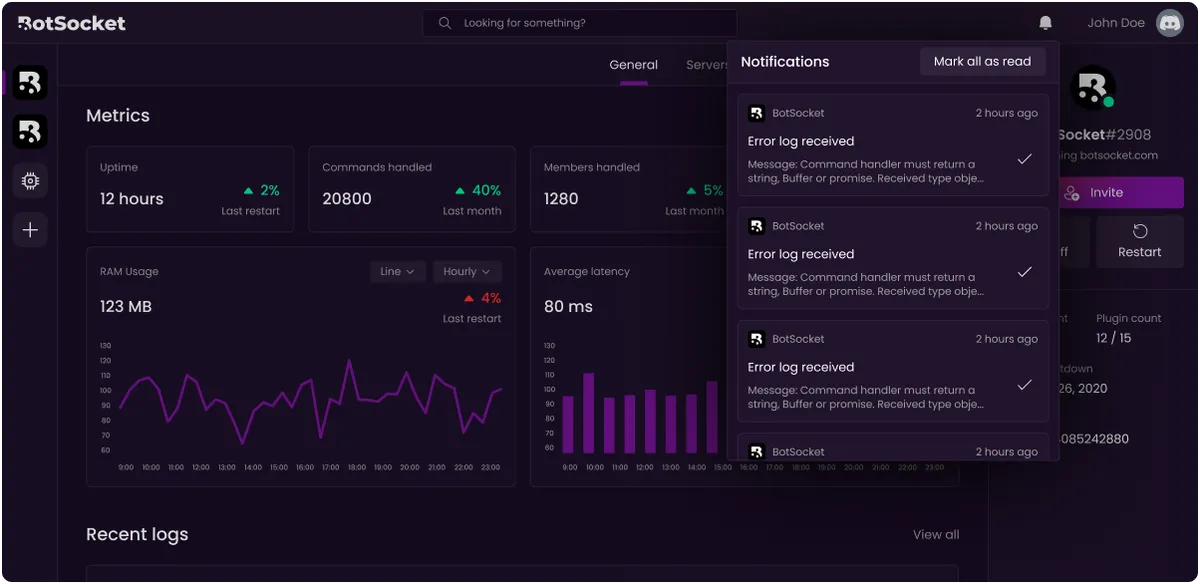
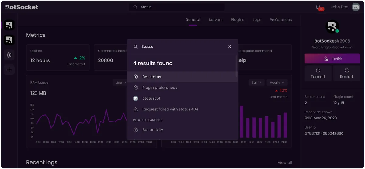
Popups like these also solve the issue of being able to easily dismiss or exit out of these menus, which can be easily done by clicking anywhere outside the popup.
These changes brought clarity to the design, and made the interface less rigid and more dynamic. Hence, we were satisfied and it became the final design.
...
Overall, as one of my first commissioned projects, I gained new experiences like working in small teams and communicating with developers.
I am ultimately very proud of the final product we produced, blending a sleek dashboard, a playful brand identity, with a functional product.
